#css media queries tutorial
Explore tagged Tumblr posts
Visit Tumblr Blog
Explore Tumblr blogs with no restrictions, modern design and the best experience.
Last Seen Tumblr Blogs


Fun Fact
In 2020, Tumblr had 29.4 million users in the US.
Text
Resource: Responsive Web Design
Starter kit basically.. for those working on jcink skins. Viewport plus using media queries, css variables, grid, and flex will ease the process of making responsive skins but I advise keeping them in mind early on.
10 notes
·
View notes
Note
Hola necro! Vengo con una duda por fascinación ya que es el segundo foro que veo tan responsivo ¿Cómo lograste que los subforos de goddess se acomodaran tan bien en Mobile? Harás algún tutorial o lo tienes?
¡Hola anon! Para los skins que tienen subforos así, lo que hago es que el diseño grid que les implemento (recomiendo los tutoriales de Kevin Powell si no saben usar grid: The EASIEST way to get started with CSS GRID, Learn CSS Grid the easy way, Get started with grid WITHOUT being overwhelmed, y tiene otros múltiples videos al respecto en esta playlist), se lo implemento directamente con una regla de media query. Goddess está hecho al revés; ambas opciones son viables, aunque últimamente estoy optando por la primera porque es mucho más eficaz. Básicamente, por defecto tus subforos están organizados uno debajo del otro (como se verán en móvil):
.frBody { display:grid; grid-template-columns:1fr; gap:1rem; }
Y con nuestra media query, establecemos nuestro diseño (retira la / después del arroba, tengo que ponerla para que tumblr no mencione a alguien llamado media 😂):
@/media (min-width:1440px) { #c1 .frBody { grid-template-columns:2fr 1fr; grid-template-rows:20rem 20rem; & .frow:first-of-type { grid-row:1 / 3; } } }
En este ejemplo random, en la categoría 1 tendremos dos columnas (siendo la de la izquierda más grande), y dos filas del mismo tamaño, y nuestro primer .frow va a empezar en la fila 1 y va a terminar en la tres, mientras que los otros dos .frow van a ocupar los otros dos huecos. Pero con grid puedes hacer el diseño que quieras, sobre todo si usas grid-template-areas/grid-area.
Me remito a los tutoriales anteriormente linkeados, fue como yo aprendí en su inicio a usar grid y hace ciertos diseños mucho más sencillos (todos mis tablones y estadísticas hoy en día están diseñadas con grid). También puedes usar el generador de grid, que en mis inicios me ayudó mucho a entender cómo funcionaba grid y cómo crear mis propios grids más tarde.
Dudo mucho que haga un tutorial de grid más que nada porque hay recursos que van a ser muchísimo más completos que lo que yo pueda hacer. Por eso les recomiendo lo que a mí me sirvió para aprender, que creo que es mucho más útil en este caso 💕
3 notes
·
View notes
Text
Mastering Web Development: A Comprehensive Guide for Beginners
In the vast landscape of technology, web development stands as a crucial cornerstone. It encompasses the art and science of building websites, ranging from simple static pages to complex web applications. Whether you're aiming to pursue a career in software development or seeking to enhance your digital presence, understanding web development is essential.
In this comprehensive guide, we'll take you through the fundamental concepts and practical skills needed to master web development from scratch. Let's dive in!
1. Understanding HTML (Hypertext Markup Language)
HTML serves as the backbone of every web page, providing the structure and content. It uses tags to define different elements such as headings, paragraphs, images, and links. By mastering HTML, you'll be able to create well-structured and semantically meaningful web documents.
2. Exploring CSS (Cascading Style Sheets)
CSS is the language used to style HTML elements, enhancing their appearance and layout. With CSS, you can customize colors, fonts, spacing, and more, giving your website a polished and professional look. Understanding CSS selectors and properties is essential for effective styling.
3. Introduction to JavaScript
JavaScript is a versatile programming language that adds interactivity and dynamic behavior to web pages. From simple animations to complex web applications, JavaScript powers a wide range of functionalities. Learning JavaScript fundamentals such as variables, functions, and events is crucial for web development.
4. Building Responsive Websites
In today's mobile-centric world, it's essential to create websites that adapt seamlessly to various screen sizes and devices. Responsive web design achieves this by using fluid grids, flexible images, and media queries. Mastering responsive design principles ensures that your websites look great on desktops, tablets, and smartphones.
5. Introduction to Version Control with Git
Git is a powerful tool for tracking changes in your codebase and collaborating with other developers. By learning Git basics such as branching, merging, and committing, you can streamline your development workflow and effectively manage project versions.
6. Introduction to Front-End Frameworks
Front-end frameworks like Bootstrap, Foundation, and Materialise provide pre-designed components and stylesheets to expedite web development. By leveraging these frameworks, you can create responsive and visually appealing websites with less effort and code.
7. Introduction to Back-End Development
While front-end development focuses on the user interface, back-end development deals with server-side logic and database management. Learning back-end languages such as Node.js, Python, or PHP enables you to build dynamic web applications and handle user interactions efficiently.
8. Deploying Your Website
Once you've developed your website, it's time to make it accessible to the world. Deploying a website involves selecting a web hosting provider, uploading your files, and configuring domain settings. Understanding the deployment process ensures that your website goes live smoothly.
9. Conclusion and Next Steps
Congratulations on completing this comprehensive guide to mastering web development! By now, you've gained a solid understanding of HTML, CSS, JavaScript, version control, frameworks, and deployment. As you continue your journey in web development, remember to stay curious, practice regularly, and explore advanced topics to further refine your skills.
Resources for Further Learning:
Online tutorials and documentation
Interactive coding platforms
Community forums and discussion groups
Next Steps:
Explore advanced topics such as web performance optimization, server-side rendering, and progressive web apps.
Build real-world projects to apply your skills and showcase your portfolio.
Stay updated with the latest trends and technologies in web development through blogs, podcasts, and conferences.
With dedication and perseverance, you'll continue to evolve as a proficient web developer, creating innovative solutions and contributing to the ever-changing digital landscape . Happy coding!
4 notes
·
View notes
Text
How to Begin Your Web Design Journey: A Step-by-Step Guide in Simple Terms
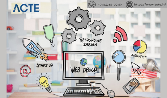
Understanding the Basics:
Learn about HTML, which is like a web page’s skeleton.
Understand CSS, which is like makeup for web pages.
Know how to make websites look good on different screens.
2. Choose your tools:
Start with simple text editors like Notepad (for Windows) or TextEdit (for Mac).
Later, try fancier editors like Visual Studio Code.
For making pictures, try Adobe Photoshop or Illustrator.
3. Learn HTML and CSS:
Use websites like W3Schools or Codecademy.
If you want to learn more about web design with certification and placement, ACTE Institute offers comprehensive machine learning training courses that can give you the knowledge and skills necessary to excel in this field. Consider the infinite possibilities for data analysis, automation, and decision-making that machine learning may create.
YouTube: There are many video tutorials covering HTML and CSS for beginners.
They teach you how to make web pages and make them look nice.
You can also learn from courses on Coursera or edX.
4. Practice your skills.
Besides learning, make simple web pages to get better.
Try harder projects as you get more confident.
Make your own website to practice lots.
5. Responsive Web Design:
Make sure your websites work well on phones and computers.
Learn about media queries (they help your design fit different screens).
6. Master CSS Layouts:
Get really good at arranging web stuff using CSS (like making boxes and arranging them nicely).
7. Web Design Frameworks:
Think about using ready-made kits like Bootstrap.
They have pre-made pieces to help you design faster.
8. UI/UX Design:
Learn to make websites easy to use and nice to look at.
Think about how people will use your site.
9. Web Hosting and Domain:
To show your website to people, you need a place to put it (hosting) and a name for it (domain).
Lots of companies can help with this, like Bluehost or HostGator.
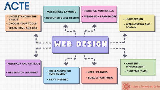
10. Content Management Systems (CMS):
Consider using tools like WordPress to manage your website easily.
11. Keep Learning:
Web design keeps changing, so keep learning new stuff.
Read blogs, watch webinars, and take more advanced classes.
12. Build a portfolio.
Make a collection of your best work to show others.
People who might hire you want to see what you can do.
13. Freelancing or employment:
Decide if you want to work alone or with a company.
Both ways have good things and not-so-good things, so pick what you like.
14. Networking:
Join groups of web designers to meet others like you.
Learning from others can help you become better.
15. Feedback and criticism:
Don’t be shy to ask for advice on your work.
When people give you tips, it helps you improve.
16. Launch your projects:
When you’re good enough, work on real websites.
Offer to make websites for friends or local businesses.
17. Stay Inspired:
Be creative and get ideas from different places.
Nature, art, and other designers can help you think of cool stuff.
18. Never Stop Learning:
Web design always changes, so keep learning new things.
Stay curious and open to learning more tricks and tools.
The secret to success in web design is to start with the fundamentals and gradually advance your abilities. Keep in mind that on this trip, patience and practice are the keys to success. As your skills advance, you’ll have the imagination needed to realise your ideas for websites. So put your hands in your pockets, launch your preferred coding editor, and start your web design experience!
4 notes
·
View notes
Text
Front end web developer skills you need to know
To become a successful front-end web developer, you’ll need a solid foundation in key skills. Mastering HTML & CSS is essential for creating the structure and style of websites.
JavaScript and ES6 add interactivity and modern functionality, while CSS & JS frameworks like Bootstrap and React streamline development.
Understanding GIT & GITHUB for version control and implementing responsive design ensures your projects work seamlessly across all devices.
In this article, we will review some of the key skills required for expert front web development.

Download Infographic
HTML & CSS
HTML (HyperText Markup Language) and CSS (Cascading Style Sheets) are the backbone of front-end web development. HTML structures the content of a web page, using elements like headings, paragraphs, links, and images.
CSS styles that content, controlling layout, colours, fonts, spacing, and responsiveness. Together, they allow developers to create visually engaging and well-structured websites.
Mastering HTML & CSS is crucial before moving on to more advanced topics like JavaScript or frameworks. You’ll need to understand concepts such as semantic HTML, CSS selectors, the box model, and media queries.
There are plenty of free and paid resources to help you learn. Great starting points include MDN Web Docs, W3Schools, and freeCodeCamp’s Responsive Web Design certification.
Platforms like Codecademy and Coursera also offer beginner-friendly courses. Practising by building small projects is one of the most effective ways to reinforce your learning.
JavaScript
JavaScript is a core technology of front-end web development, used alongside HTML and CSS to create dynamic, interactive websites. While HTML provides the structure and CSS handles styling, JavaScript enables user interaction by manipulating elements on the page in real-time.
It’s responsible for features such as form validation, image sliders, dropdown menus, modal windows, and dynamic content updates without reloading the page (using AJAX). JavaScript interacts with the Document Object Model (DOM), allowing developers to modify HTML and CSS based on user actions like clicks, scrolls, or keystrokes.
Modern front-end development often uses JavaScript libraries and frameworks such as React, Vue.js, or jQuery to streamline development and enhance functionality. Understanding JavaScript fundamentals is essential before diving into these tools.
There are excellent resources to learn JavaScript, whether you’re a beginner or looking to advance your skills. Top recommendations include JavaScript.info, MDN Web Docs, and freeCodeCamp. You can also find interactive tutorials on Codecademy, as well as comprehensive courses on platforms like Udemy and Coursera.
For in-depth understanding, the book Eloquent JavaScript is highly regarded in the developer community. Practising through small projects and coding challenges will solidify your knowledge.
ES6
ES6 (ECMAScript 2015) is a major update to the JavaScript language, introducing powerful new features that make coding more efficient and maintainable. It brought significant improvements to JavaScript syntax and functionality, including let and const for block-scoped variable declarations, arrow functions for cleaner, more concise function expressions, template literals for easier string formatting, and destructuring for simplifying data extraction from arrays and objects.
ES6 also introduced promises for better handling of asynchronous operations, modules for organising code into reusable components, and classes for a more structured, object-oriented approach to JavaScript development.
ES6 has become a standard in front-end web development, forming the backbone of modern frameworks like React, Vue.js, and Angular, where these features are heavily utilised to create fast, scalable, and maintainable web applications. It also improves code readability and reduces common bugs, making it an essential skill for front-end developers.
To learn ES6, great resources include MDN Web Docs, JavaScript.info, freeCodeCamp’s JavaScript course, and Codecademy’s interactive tutorials. The book Eloquent JavaScript also covers ES6 in depth, while platforms like Udemy and Coursera offer structured courses for more in-depth learning. Practising with real-world projects is the best way to master ES6.
CSS & JS Frameworks
CSS and JavaScript frameworks play a vital role in front-end web development by streamlining the coding process and reducing development time.
CSS frameworks like Bootstrap, Tailwind CSS, and Foundation provide pre-written CSS classes and components for creating responsive layouts, navigation menus, buttons, and more. They help ensure consistent design and save developers from writing repetitive code.
JavaScript frameworks such as React, Vue.js, and Angular offer structured approaches to building interactive user interfaces and managing complex application states. These frameworks simplify DOM manipulation, improve performance, and enable the creation of reusable components.
By using these frameworks, developers can build modern, responsive, and scalable web applications more efficiently.
To learn CSS frameworks, explore the official documentation for Bootstrap or Tailwind CSS, as well as tutorials on freeCodeCamp and W3Schools. For JS frameworks, the React and Vue.js official docs, MDN Web Docs, Codecademy, and Scrimba offer excellent learning paths.
GIT & GITHUB
GIT and GitHub are essential tools for front-end web developers, enabling efficient version control and collaboration. GIT is a distributed version control system that tracks code changes, allowing developers to manage project history, revert to earlier versions, and work on multiple features simultaneously using branches.
GitHub is a cloud-based platform that hosts GIT repositories, making it easy for developers to collaborate, share code, and contribute to open-source projects. It also offers features like pull requests, code reviews, and issue tracking to streamline development workflows.
In front-end web development, GIT and GitHub are used to manage code for websites and applications, ensuring version control and seamless collaboration. They also make it easy to showcase projects in a professional portfolio.
To learn GIT and GitHub, consider GitHub Learning Lab, freeCodeCamp, Codecademy, and MDN Web Docs. Platforms like GitHub Docs and GitKraken also provide excellent guides and tutorials for beginners.
Responsive Design
Responsive design is a crucial aspect of front-end web development, ensuring that websites look and function well across a wide range of devices, from mobile phones to large desktop screens.
It focuses on creating flexible layouts, images, and components that automatically adjust to different screen sizes and orientations. This approach enhances user experience, boosts SEO, and reduces bounce rates by delivering a consistent browsing experience, regardless of the device.
Responsive design relies on key techniques like media queries, flexbox, and CSS grid to control the layout and structure of a website. Fluid grids and responsive images ensure content scales appropriately, while mobile-first design prioritises smaller screens before scaling up to larger devices.
Many front-end frameworks, like Bootstrap and Tailwind CSS, include built-in responsive design features, making it easier to create flexible layouts.
In modern front-end development, responsive design is essential, as mobile traffic continues to grow. It’s a core requirement for building professional websites and web applications.
To learn responsive design, consider resources like MDN Web Docs, W3Schools, and freeCodeCamp’s Responsive Web Design certification.
Books like Responsive Web Design with HTML5 and CSS by Ben Frain and platforms like Codecademy also offer comprehensive tutorials.
Building small projects and experimenting with media queries is a practical way to master this vital skill, ensuring your web pages deliver a seamless experience across all devices.
Conclusion
Mastering front-end web development skills like HTML & CSS, JavaScript, ES6, CSS & JS frameworks, GIT & GitHub, and responsive design is essential for building modern, high-performing websites.
These skills form the foundation of interactive, responsive, and visually appealing web pages. By leveraging powerful frameworks and adopting best practices, you can streamline your workflow and create exceptional user experiences.
With countless online resources available, from MDN Web Docs to freeCodeCamp, there’s never been a better time to start your front-end development journey. Keep practising, stay curious, and continue expanding your skill set to become a proficient developer.
Article first published: https://dcpweb.co.uk/blog/front-end-web-developer-skills-you-need-to-know
0 notes
Text
Mastering CSS Grid and Flexbox: A Designer’s Guide

Mastering CSS Grid and Flexbox: A Designer’s Guide CSS Grid and Flexbox are two powerful layout systems in modern web design, enabling designers to create responsive, flexible, and visually appealing layouts with ease.
Here’s a guide to mastering them:
Understanding CSS Flexbox What It Is:
Flexbox (short for Flexible Box Layout) is a one-dimensional layout system used for aligning items in a row or column.
Key Concepts:
Flex Container: The parent element where Flexbox rules apply. Flex Items: The child elements inside the container.
Axis Control: Layout is managed along the main axis (row/column) and cross-axis (perpendicular to the main axis).
Common Properties: display:
flex: Enables Flexbox on the container. justify-content: Aligns items along the main axis (e.g., flex-start, center).
align-items: Aligns items along the cross-axis.
flex-grow and flex-shrink: Control how items grow or shrink.
Use Cases:
Centering elements, creating navigation bars, and handling dynamic content layouts.
2. Understanding CSS Grid What It Is: CSS Grid is a two-dimensional layout system designed for managing both rows and columns.
Key Concepts: Grid Container:
The parent element where grid rules apply.
Grid Items: The child elements placed inside the container.
Tracks: Rows and columns that define the layout. Grid Lines: Invisible lines separating tracks.
Common Properties:
display: grid:
Enables Grid on the container. grid-template-rows and grid-template-
columns: Define the structure of rows and columns.
gap: Adds spacing between grid items. grid-area: Specifies item placement within the grid.
Use Cases: Complex layouts like dashboards, image galleries, and multi-column designs.
3. Flexbox vs. Grid:
When to Use What Flexbox: Ideal for simpler, one-dimensional layouts (e.g., nav bars, menus).
Grid: Best for two-dimensional layouts with intricate designs (e.g., page layouts, responsive grids).
Combined Use: Both can be used together for maximum flexibility.
4. Tips for Mastery Start Simple:
Experiment with small layouts to understand core properties.
Practice Responsiveness:
Use media queries with grid-template-areas or flex-wrap to build responsive designs.
Learn Naming Conventions:
Use meaningful class names to keep layouts organized. Explore Browser
Dev Tools:
Inspect grid and flex layouts visually using browser tools.
5. Tools and Resources Practice Tools:
CodePen, JSFiddle for live experimentation. Learning Resources: MDN Web Docs, CSS-Tricks tutorials.
Grid Generators:
Tools like CSS Grid Generator and Flexbox Froggy (game-based learning).
Conclusion
Mastering CSS Grid and Flexbox empowers designers to create visually stunning and responsive layouts efficiently.
By understanding their capabilities and knowing when to use each system, designers can craft modern websites that offer both functionality and aesthetic appeal.

0 notes
Text
6 Common Mistakes to Avoid in Web Development
Coding and technical development of a website might seem like a challenge but it indeed is an exciting journey for many web developers. However, as a beginner, developing a website for the first time can bring along many mistakes that you might overlook in the beginning.
For this reason, knowing useful ways of avoiding website development mistakes are crucial, if you are rectifying them yourself or considering a professional and seasoned company specialising in web development in Melbourne. Let’s go over 10 common mistakes to stay ahead of the competition and make your website bug-free.
1. Skipping the Fundamentals of Website (HTML, CSS, and JavaScript)
The Mistake:
Web development is evolving and so are the growing use of frameworks like React, Vue, or Angular. These technologies have features that let you build a website but ignoring basic coding fundamentals like HTML, CSS, and JavaScript can be a blunder.
Why Is It a Problem?
Frameworks are powerful for specialised websites and do not always fit in when a basic coding structure can help. If you are only relying on web technologies, you will not be able to fix basic coding problems if website bugs appear to bother later.
The Solution:
Take the time to learn fundamentals first and then use frameworks. Tutorials can help but if that is not possible, then finding services like web development in Melbourne which aim for creating a website with HTML structure, CSS styling, and Javascript interactivity initially is the best solution.
2. Not Making Websites Mobile Responsive
The Mistake:
Another possible website creation mistake that you may not realise is designing a website on desktop but forgetting to add responsive principles for mobiles.
Why Is It a Problem?
Majority of people scroll websites from their mobile devices, and a non-responsive website will appear flat and apart on small screens. Ultimately, not planning mobile-friendly design principles can increase bounce rates.
The Solution:
Make sure to apply responsive design principles from the start. Use flexible grids like CSS Grid or Flexbox, relative units like % or rem, and media queries to adapt your website on smaller screen sizes. If professional help is needed, find services like web development in Melbourne for better use of the tools.
3. Too Many Features
The Mistake:
Including every feature or plugin like animations, pop-ups, sliders, and hard-to-understand user interface elements can make your website heavy.
Why Is It a Problem?
Too many features, including some unnecessary ones, can bog down the website, confuse the users, and can even make the web development process forever to end.
The Solution:
Focus on simple and the most useful features on a website. If a feature is not directly helping the target audiences, it is better to leave it.
4. Ignoring the Value of Version Control
The Mistake:
Avoiding version control systems from the beginning of website development.
Why Is It a Problem?
A version control is an efficient tool that lets you track any changes to the code structure, manage multiple changes when more than one developer is working on a website, and revert to the previous versions. Without it, you will not have access to different versions and find errors in coding.
The Solution:
Learn the basics of Git and GitHub. Initialise a Git repository in your website-making process right from the start and commit to making changes regularly. This way, if something goes wrong, you can easily roll back to a previous version. Every developer needs it, however, having a professional web development in Melbourne should make the tool usage convenient.
5. Not Testing Across Different Browsers
The Mistake:
It can be possible to have a website look great on one browser, neglecting its functionality and aesthetics on other browsers.
Why Is It a Problem?
Different browsers convert HTML and CSS coding differently than the other which can make the website look inconsistent on each browser.
The Solution:
Ensure website testing across multiple browsers with the help of a web development company tried and tested tools in Melbourne.
6. Saying No to Optimising Website Performance
The Mistake:
Not paying attention to the website loading speed.
Why Is It a Problem?
Users have little patience for slow websites. If your site takes too long to load, visitors will leave before they even see your content.
The Solution:
Compressing images, minimising CSS and JavaScript files, and leveraging browser caching is the key that helps web development in Melbourne.
Final Words
We hope you found this blog useful. Coming to an end, it is clear that making mistakes when creating a website is temporary when you can find the right solutions. The key is to recognise these mistakes early on and learn from them.
The above solutions help you prevent common pitfalls to become a more confident and competent developer. Keep experimenting, keep building, and don’t be afraid to make mistakes. If possible, find a web development company in Melbourne for best results.
0 notes
Text
Unlock Responsive Designs with Adaptive Layouts using CSS and Media Queries
Implementing Adaptive Layouts with CSS and Media Queries Introduction Implementing adaptive layouts with CSS and media queries is an essential technique for creating responsive and accessible web applications. Adaptive layouts allow your application to adjust its layout based on various factors such as screen size, device orientation, and user preferences. In this tutorial, you’ll learn how to…
0 notes
Text
What to Learn After Html , CSS ,JS ? In today’s ever-evolving tech landscape, knowing what to learn after HTML, CSS, and JavaScript is essential for any aspiring developer One of the most recommended next steps is learning React, a powerful JavaScript library for building dynamic user interfaces. But before we dive into why React is critical, let’s first explore the broader learning journey for developers and what they should master after the basics.

Understanding the Basics: Why HTML, CSS, and JavaScript Aren’t Enough
HTML gives structure to web content, CSS styles it, and JavaScript makes it interactive. While essential, these technologies can't efficiently manage the complexities of large-scale projects. That's where libraries and frameworks come in, making it easier to organize code, handle complex UI states, and improve scalability.
What Should You Learn After HTML, CSS, and JavaScript? As a student, once you have gained proficiency in the basics, you’ll be eager to advance your career. Let’s look at some crucial skills to focus on: Version Control with Git and GitHub To work on real-world projects like my project and collaborate with other developers, version control is key. Learn Git to track changes in your code and use GitHub to manage and share projects with teams. Responsive Design With the diversity of devices today, ensuring your websites look good on all screen sizes is crucial. Learning responsive web design techniques using CSS media queries and flexbox will elevate your web development skills. JavaScript ES6+ JavaScript continues to evolve, and keeping up with the latest updates in ES6 (and beyond) is important. Key concepts like arrow functions, promises, and async/await can simplify your code and make it more efficient. Backend Technologies You may want to start learning backend technologies like Node.js for full-stack development. With knowledge of Node.js, you can handle both the frontend and backend of applications. React: Your Gateway to Modern Frontend Development After mastering the core skills, learning React is the logical next step.
Why Learn React After HTML, CSS, and JavaScript? React has taken the web development world by storm, becoming one of the most sought-after skills by companies worldwide. Here’s why you should seriously consider mastering React:
High Demand in the Job Market React developers are in high demand globally, and especially in tech hubs like Pune, where many companies focus on building web and mobile applications. Mastering React opens doors to better job opportunities in app development in Pune, where companies seek developers with strong React skills.
Component-Based Architecture React’s component-based architecture allows developers to break down complex UIs into smaller, reusable pieces. This results in more manageable code, reduced redundancy, and faster development times.
React Ecosystem and Tooling React has a rich ecosystem of libraries and tools like React Router and Redux. These tools help in building scalable, production-ready applications and handling client-side routing and state management.
Strong Community and Documentation React boasts a massive community of developers who contribute to a wealth of online resources, tutorials, and open-source projects. This makes it easier for new learners to pick up the technology and find solutions to common problems.
Power of JSX JSX (JavaScript XML) is a syntax extension for JavaScript used in React, enabling you to write HTML elements within JavaScript code. This makes the code more readable and concise, streamlining the development process.
Career Flexibility Knowing React not only qualifies you for front-end developer roles but also positions you to work with mobile apps, thanks to React Native. Many companies, including android development companies in Pune, are looking for React developers who can seamlessly transition between web and mobile development.
Exploring Career Options: React and Beyond Once you’re comfortable with React, it’s time to further specialize. Here are some technologies that will make you even more competitive: Learn Next.js Next.js is a React framework for building optimized and fast web applications. It includes features like server-side rendering (SSR) and static site generation (SSG), making it ideal for building modern web apps. Mobile Development with React Native React Native enables you to build mobile applications using the same React principles. It’s highly popular among android application development companies in Pune due to its efficiency in building cross-platform apps. Database Management Learn databases such as MongoDB or MySQL to manage the backend of your web applications. Pairing React with a powerful database can lead to a full-stack developer role.
Tech Companies in Pune and Opportunities for Developers If you're based in Pune, you're in luck! Pune is a burgeoning tech hub with a plethora of opportunities for developers. Below are some key insights into IT companies in Pune and what they offer:
App Development in Pune
Many android development companies in Pune are on the lookout for React developers, especially those who can transition into mobile development roles. Whether you aim to join a startup or a well-established firm, mastering React will position you for success.
Top IT Companies in Kothrud and Kondhwa
Areas like Kothrud and Kondhwa are home to several IT companies that focus on web and app development. Some notable companies provide services like custom web development and cloud application services, creating a booming job market for skilled developers.
How Implause IT Can Help You Grow
If you’re looking for a company that provides top-notch IT solutions, Implause IT is here to help. Based in Pune, we specialize in providing a wide range of services, including:
Custom Web Development Services in Pune
Tailored web solutions that meet your specific IT needs. We craft engaging websites with cutting-edge UI/UX designs to ensure the best user experience.
Quick Commerce Service at Reasonable Prices
Our quick commerce services help ITes streamline their operations and get products to customers faster. We provide solutions that enhance efficiency at competitive prices.
Cloud Application Services
We offer end-to-end cloud application services in Pune and Kondhwa, ensuring that your IT runs smoothly in the cloud with high levels of security and performance.
FAQs
What is the next step after learning HTML, CSS, and JavaScript?
After learning these foundational technologies, it’s recommended to learn React. It helps you build dynamic user interfaces and enhances your job prospects.
Why should I learn React?
React is highly in demand, offers reusable components, and has a robust ecosystem. It is perfect for building complex, scalable web applications.
Which companies in Pune hire React developers?
Several IT companies in Kothrud, Kondhwa, and app development companies in Pune are looking for React developers, especially those with mobile development experience.
What is the best way to learn React?
Start by learning the fundamentals of React, including components, JSX, and state management. Follow tutorials and work on real-world projects to solidify your understanding.
Are there React development jobs in Pune?
Yes, many companies in Pune, especially in Kothrud and Kondhwa, are actively hiring React developers for both web and mobile development roles.
What services does Implause IT offer?
Implause IT provides custom web development, cloud application services, and quick commerce services in Pune at reasonable prices.
Conclusion Mastering React after learning HTML, CSS, and JavaScript is a smart move for any aspiring web developer. React opens up doors to career opportunities in both web and mobile development. With Pune being a thriving tech hub, particularly in areas like Kothrud and Kondhwa, you’ll find plenty of opportunities in app development and website development companies in Pune. Plus, companies like Implause IT can assist in your journey with services that are tailored to boost your tech career and IT growth.
0 notes
Text
Tips and Tricks for Mastering Front-End Development
The face of modern IT solutions and services is front-end development, which is vital for creating more interactive, user-friendly websites and applications. Selecting the best IT solutions provider is also largely dependent on front-end development, which is the face of the web application and requires expertise in coding languages like HTML, CSS, and JavaScript. Gaining proficiency in front-end development is a lifelong process that requires constant learning and improvement, regardless of experience level. These pointers will help you improve your knowledge of front-end development.
1. Keep abreast of emerging trends and technologies:
Front-end development is a rapidly evolving field that adapts to new frameworks, tools, and best practices as they become available. Therefore, it is crucial to stay current to be effective and competitive in the field.
Follow Industry Leaders: You can learn a lot about the most recent advancements from the majority of the industry leaders who have blogs, social media profiles, and forums.
Attend Conferences and Meetups: You can network with other professionals in your field of work and gain exposure to new tools and techniques by attending local meetups and conferences on web development.
Online tutorials and courses: These provide new frameworks, libraries, and best practices to learn about.
2. Get the Fundamentals Right:
It is necessary to have a sufficient understanding of HTML, CSS, and JavaScript before learning a more complex framework or library.
HTML: Gain an understanding of the elements, attributes, and semantic HTML5 tags, as well as the structure of HTML documents.
CSS: Learn more about animations, flexbox, grid, box model, selectors, and responsive design concepts.
Learn the fundamentals of JavaScript, including loops, events, variables, and functions. Examine some of the more recent additions to JavaScript, like promises, async/await, and ES6+ syntax.
3. Learn about responsive design:
Since mobile devices are now used by the majority of Richardlinux users to browse websites, responsive designs—those that work flawlessly on large monitors as well as tiny screens—are essential.
Media Queries: To apply different styles based on screen size, use CSS media queries.
Flexible Grids and Layouts: When designing a fluid structure that can accommodate various screen sizes, use flexible grid systems and layouts.
Design Using the Mobile-First Method: Design ought to begin on the smallest screen and progress to larger screens.
4. Enhance Efficiency:
It suggests that the website's operation is optimized for a quick user experience. It guarantees that a website with a slow loading speed will have a high bounce rate and low user satisfaction.
Reduce the Number of HTTP Requests: In addition to using CSS sprites for images, you can reduce the number of HTTP requests by minifying and combining CSS and JavaScript files.
Image optimization is the process of using next-generation image formats, such as WebP, to compress images without sacrificing quality or maintaining quality.
Lazy loading can be applied to images as well as other resources, allowing content to load only when needed.
A content delivery network (CDN) reduces latency and speeds up loading times by distributing the content among several servers.
Conclusion
Mastering front-end development is crucial for creating visually appealing and user-friendly websites. From understanding the basics of HTML, CSS, and JavaScript to mastering advanced frameworks like React and Angular, the right approach can make all the difference. Softieons, an IT company that specializes in front-end development services, offers expert guidance to help you navigate this ever-evolving field. With their innovative solutions and deep industry knowledge, Softieons ensures that your front-end projects are not only functional but also highly engaging and responsive, delivering a seamless user experience.
1 note
·
View note
Text
Steps to learn web designing

Learning web designing involves a combination of technical skills, creativity, and understanding of user experience principles. Here are the steps to get started:
1. Understand the Basics of Web Design
Learn HTML: Start with HTML (HyperText Markup Language), the standard language for creating web pages.
Resources: W3Schools HTML Tutorial, MDN HTML Guide
Learn CSS: CSS (Cascading Style Sheets) is used to style and layout web pages.
Resources: W3Schools CSS Tutorial, MDN CSS Guide
2. Master Responsive Design
Learn about Media Queries: Understand how to make websites look good on all devices (desktops, tablets, and phones).
Resources: W3Schools Responsive Web Design
Learn CSS Frameworks: Familiarize yourself with frameworks like Bootstrap to streamline the design process.
Resources: Bootstrap Documentation
3. Get Comfortable with JavaScript
Learn JavaScript: JavaScript is essential for creating interactive websites.
Resources: W3Schools JavaScript Tutorial, MDN JavaScript Guide
Learn a JavaScript Framework/Library: Libraries like React, Angular, or Vue.js can help in building more dynamic web applications.
Resources: React Documentation, Vue.js Documentation, Angular Documentation
4. Understand Web Design Principles
Learn UI/UX Design Basics: Understand the principles of user interface (UI) and user experience (UX) design.
Resources: Interaction Design Foundation, UX Design Institute
Study Web Design Trends: Stay updated with the latest trends in web design.
Resources: Awwwards, Smashing Magazine
5. Learn About Web Development Tools
Text Editors: Learn to use code editors like Visual Studio Code, Sublime Text, or Atom.
Resources: Visual Studio Code Documentation
Version Control: Learn version control systems like Git.
Resources: Git Documentation
6. Build Your Portfolio
Create Projects: Build your own projects to showcase your skills. Start with simple websites and gradually take on more complex ones.
Ideas: Personal blog, portfolio site, landing pages, small web applications
Contribute to Open Source: Participate in open-source projects to gain experience and collaborate with other developers.
Resources: GitHub
7. Stay Updated and Keep Learning
Follow Blogs and Tutorials: Keep learning from online tutorials, blogs, and web design communities.
Resources: CSS-Tricks, Smashing Magazine
Take Advanced Courses: Consider taking advanced courses or certifications to deepen your knowledge.
Resources: Coursera, Udemy
8. Get Feedback and Iterate
Join Communities: Participate in web design forums and communities to get feedback on your work.
Resources: Dribbble, Behance
Iterate on Designs: Use the feedback to improve your designs and continuously refine your skills.
By following these steps, you'll build a strong foundation in web design and be able to create visually appealing and functional websites.
TCCI Computer classes provide the best training in all computer courses online and offline through different learning methods/media located in Bopal Ahmedabad and ISCON Ambli Road in Ahmedabad.
For More Information:
Call us @ +91 98256 18292
Visit us @ http://tccicomputercoaching.com/
#Best Website design course in Bopal-Ahmedabad#learn Javascript in Bopal-Ahmedabad#web design course for kids in Bopal-Ahmedabad#online web design course in Bopal-Ahmedabad#computer class in Bopal-Ahmedabad
0 notes
Text
HTML5 and CSS3 for Responsive Web Design: Tips, Tricks, and Tutorials

Creating a responsive website means your site will look great and work well on any device, from large desktop monitors to small mobile screens. In this responsive HTML5 and CSS3 tutorial, we will explore some key concepts to help you design a site that adapts to various screen sizes.
First, it's important to control the viewport settings. This tells the browser how to adjust the page dimensions and scaling. Setting the viewport properly ensures that your website scales correctly on all devices.
Next, design your website using flexible layouts. Instead of setting fixed widths, use percentages. This allows the layout to adjust based on the screen size. For example, if your content container is set to 80% of the screen width, it will automatically resize when the screen size changes, providing a consistent look across devices.
Images should also be flexible. Ensuring that images resize within their containers prevents them from breaking the layout on smaller screens. This can be done by setting the maximum width of the images to 100% of their container.
Media queries are essential for responsive design. These allow you to apply different styles depending on the screen size. For instance, you might want to change the layout for screens that are smaller than 600 pixels. Media queries enable you to do this by specifying different CSS rules for different screen sizes.
With these simple steps, you can start building responsive websites using HTML5 and CSS3. Remember, testing your design on multiple devices is crucial to ensure it looks and works perfectly everywhere.
For a more detailed guide, check out this comprehensive tutorial. Happy coding!
0 notes
Text

Learn to create responsive websites with this comprehensive HTML5 and CSS3 tutorial, covering flexible layouts, media queries, and best practices for ensuring optimal performance across all devices.
0 notes
Text
Customizing Your WordPress Site with CSS: A Beginner's Tutorial - Web Design Company in Mumbai, India - Devki Infotech India Pvt. Ltd.
Customizing your WordPress site with CSS allows you to personalize its appearance by modifying layouts, colors, fonts, and more. This beginner's tutorial by Devki Infotech India Pvt. Ltd., a leading web design company in Mumbai, India, guides you through the basics of CSS and how to apply it to your WordPress site. Start by adding custom CSS through the WordPress Customizer or a child theme to ensure changes are preserved during theme updates. You can also use custom CSS plugins for an easier interface. Common customizations include changing background colors, styling headings, and adjusting layouts. For advanced tweaks, use browser developer tools to inspect elements and write responsive designs with media queries. Remember to test your changes across different browsers and devices. For professional assistance, contact Devki Infotech India Pvt. Ltd. and transform your website today.
0 notes
Text
Web Designing Course in Sonipat.
Here's a comprehensive course outline for a web design course offered by Pickles Animation. This course is designed to cater to both beginners and advanced learners, covering essential tools, techniques, and industry insights.
Course Outline for Web Design
Module 1: Introduction to Web Design
Overview of Web Design
History and evolution of web design
Key principles of web design (layout, color, typography)
Understanding the web design process
Web Technologies
Basics of HTML and CSS
Introduction to JavaScript
Understanding web browsers and how they work
Module 2: HTML and CSS Fundamentals
HTML Basics
HTML syntax and structure
Common HTML tags and attributes
Creating forms and tables
CSS Basics
CSS syntax and selectors
Styling text, colors, and backgrounds
Box model, padding, margin, and borders
Advanced HTML and CSS
Flexbox and CSS Grid layout systems
Responsive design principles and media queries
CSS transitions and animations
Module 3: JavaScript and Interactive Design
JavaScript Basics
JavaScript syntax and variables
Functions and events
DOM manipulation
Advanced JavaScript
Working with APIs and AJAX
ES6+ features
JavaScript frameworks (e.g., React, Vue.js)
Interactive Design
Enhancing user interactions with JavaScript
Introduction to jQuery
Creating interactive forms and components
Module 4: Web Design Tools and Software
Design Software
Adobe XD, Figma, or Sketch for UI design
Creating wireframes and prototypes
Collaborating and sharing designs
Development Tools
Code editors (e.g., Visual Studio Code, Sublime Text)
Version control with Git and GitHub
Browser developer tools for debugging
Module 5: Advanced Web Design Techniques
UI/UX Design Principles
User-centered design
Accessibility and inclusive design
Usability testing and feedback
Responsive and Adaptive Design
Mobile-first design approach
Progressive enhancement and graceful degradation
Testing and optimizing for various devices
Performance Optimization
Image and asset optimization
Minification and compression techniques
Lazy loading and caching strategies
Module 6: Content Management Systems (CMS)
Introduction to CMS
Understanding CMS and its benefits
Overview of popular CMS platforms (e.g., WordPress, Joomla, Drupal)
Working with WordPress
Setting up a WordPress site
Customizing themes and templates
Managing plugins and widgets
Module 7: E-commerce and Web Applications
E-commerce Fundamentals
Setting up an online store
Payment gateway integration
Product management and inventory
Web Applications
Introduction to web app development
Basics of backend development (e.g., Node.js, PHP)
Working with databases (e.g., MySQL, MongoDB)
Module 8: Portfolio Development and Career Preparation
Building a Web Design Portfolio
Selecting and showcasing your best work
Creating case studies and project descriptions
Designing a portfolio website
Career Preparation
Freelancing vs. working for an agency
Job search strategies and interview tips
Networking and professional development
Additional Features
Guest Lectures and Workshops: Sessions by industry experts on various topics.
Hands-On Projects: Real-world projects to apply learned skills.
Feedback and Critique Sessions: Regular feedback from instructors and peers.
Online Resources and Community: Access to tutorials, forums, and networking opportunities.

This course structure ensures that students gain a solid foundation in web design, practical experience with essential tools and techniques, and preparation for a successful career in the web design industry.
0 notes
Text
The Complete Guide to Front-End Development

The dynamic and always changing field of front-end development is essential to producing the interesting and interactive user interfaces that people use when they visit websites and utilise web apps. Whether you’re a seasoned developer hoping to brush up on your abilities or a novice hoping to make a name for yourself in the tech sector, this in-depth tutorial will take you through every step of front-end programming.
1. Overview of Front-End Programming
The user-facing aspect of web development is the emphasis of front-end development. It entails designing the visual components of a website or online application while making sure they are both aesthetically beautiful and useful. Static designs are brought to life and integrated with server-side logic by front-end developers in close collaboration with designers and back-end developers.
2. Foundational Technologies
HTMLHyperText Markup Language, or HTML, is the basis of every online page. It defines terms like headings, paragraphs, links, and photos and provides the text its structure and meaning.
Web pages can be styled and organised using Cascading Style Sheets, or CSS. It offers developers total control over layout, formatting, and presentation, enabling them to create designs that are both responsive and aesthetically beautiful.
JavaScript Programming languages like JavaScript are flexible and allow for interactive online features like animations, multimedia controls, and dynamic content updates. Creating compelling user experiences is crucial.
3. Frameworks and Libraries for the Front End
React is a well-liked JavaScript library for creating user interfaces that was created by Facebook. It enables programmers to efficiently manage the state of complicated programmes and build reusable components.
Angular Angular is a complete web application development framework, supported by Google. It offers a comprehensive feature set and tool set for creating maintainable and scalable applications.
Vue.js A progressive JavaScript framework that is simple to incorporate into projects is called Vue.js. It is a fantastic option for both small- and large-scale applications since it provides an adaptable and approachable structure.
4. Development Environment and Tools
Editors for text Text editors and integrated development environments (IDEs) in popularity include WebStorm, Sublime Text, and Visual Studio Code. Essential functionality like code completion, syntax highlighting, and debugging capabilities are offered by these tools.
Using Git for Version Control Git is a version control tool designed to assist developers in controlling alterations made to their code. Code sharing and collaboration are made easier by platforms such as Bitbucket, GitLab, and GitHub.
Managers of Packages Developers may effectively manage project dependencies by using package managers like as Yarn and npm (Node Package Manager) to make sure the right libraries and tools are being used.
5. Accessibility and Responsive Design
Developers may construct responsive designs with media queries, which guarantee a consistent user experience across devices by accommodating varying screen sizes and orientations.
Grid CSS and Flexbox CSS Strong layout modules like Flexbox and Grid offer effective and versatile solutions to create intricate layouts without the need for floats or placement.
The Semantic HTML and ARIA Semantic HTML elements and ARIA (Accessible Rich Internet Applications) enhance web accessibility, enabling persons with disabilities to use websites. Adherence to accessibility guidelines is ensured by the appropriate application of these methods.
6. Enhancement of Performance
Minimising Load Time: By drastically cutting down on load times, techniques like minification, compression, and caching can improve user experience.
Divided Code Developers can reduce the initial load time of their programme by breaking it up into smaller parts that can be loaded on demand thanks to code splitting.
Sluggish Loading Scripts and other non-essential resources, including images, are loaded later on when they are needed thanks to lazy loading. Both performance and bandwidth use can be increased using this strategy.
7. The Unit Testing and Debugging
An application’s component elements are tested individually to ensure they function as planned. We call this procedure “unit testing.” Popular testing frameworks include Jest, Jasmine, and Mocha.
Integration Analysis Integration testing looks at how well an application’s several components work together. Tools like Cypress and Selenium make automated integration testing easier.
Instruments for Troubleshooting Modern browsers come with powerful debugging tools like Firefox Developer Tools and Chrome DevTools to help developers identify and fix issues with their code.
8. Installation and Hosting
Continuous Integration/Deployment, or CI/CD CI/CD pipelines ensure smooth integration and dependable change deployment by automatically testing and deploying applications.
Among the well-known web hosting providers are AWS Amplify, Vercel, and Netlify. These platforms offer a plethora of features, such as SSL certificates, bespoke domains, and automatic deployments.
9. Staying Current: Social Media and Educational Materials
Online Courses and Tutorials Websites like Udemy, Coursera, and freeCodeCamp offer in-depth lessons and courses on front-end programming subjects for students of all skill levels.
Conferences and Developer Communities Interacting with online communities such as Stack Overflow, GitHub, and Reddit can yield significant benefits and guidance. You can keep up with the newest trends and technology by going to conferences like FrontendConf, React Conf, and Google I/O.
Conclusion
The field of front-end development blends technical proficiency and creativity, making it an exciting and fulfilling career choice. You may create dynamic and effective web apps by studying the fundamentals, utilising contemporary frameworks and tools, and never stopping learning. Make the most of your adventure by being curious, continuing to explore, and joining the active community of front-end developers.
Are you ready to take your skills to the next level and become a master of web interfaces? Enroll in the front end developer course at LearNowx today! Our comprehensive program covers everything from HTML and CSS to advanced JavaScript frameworks and responsive design techniques. Gain hands-on experience, learn from industry experts, and join a community of passionate developers. Don’t miss this opportunity to elevate your career — sign up now at LearNowx and start your journey to becoming a top-tier front end developer!
0 notes